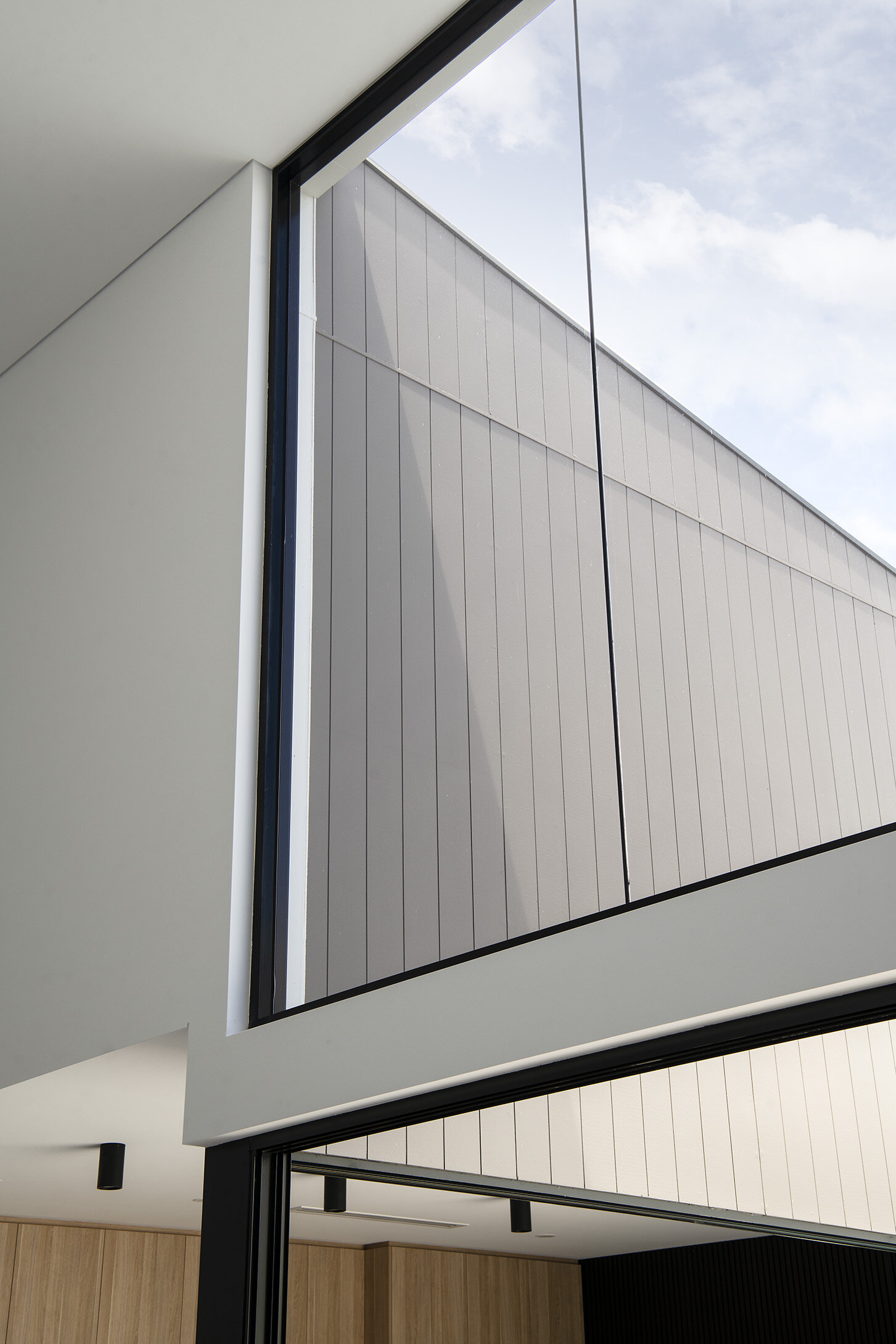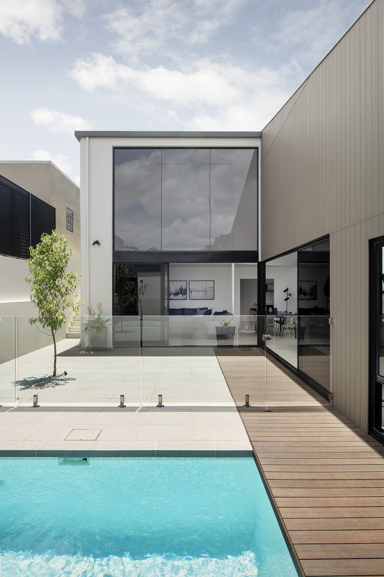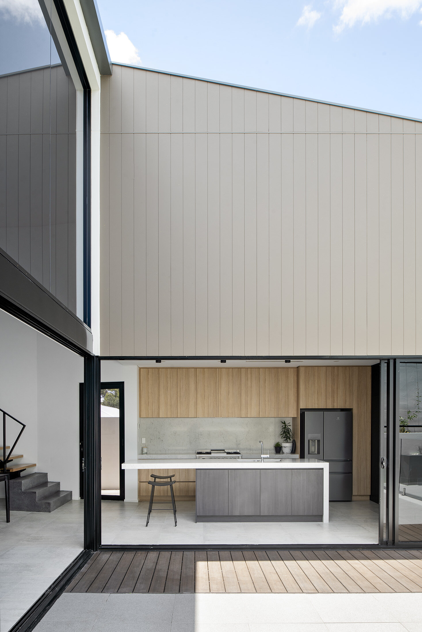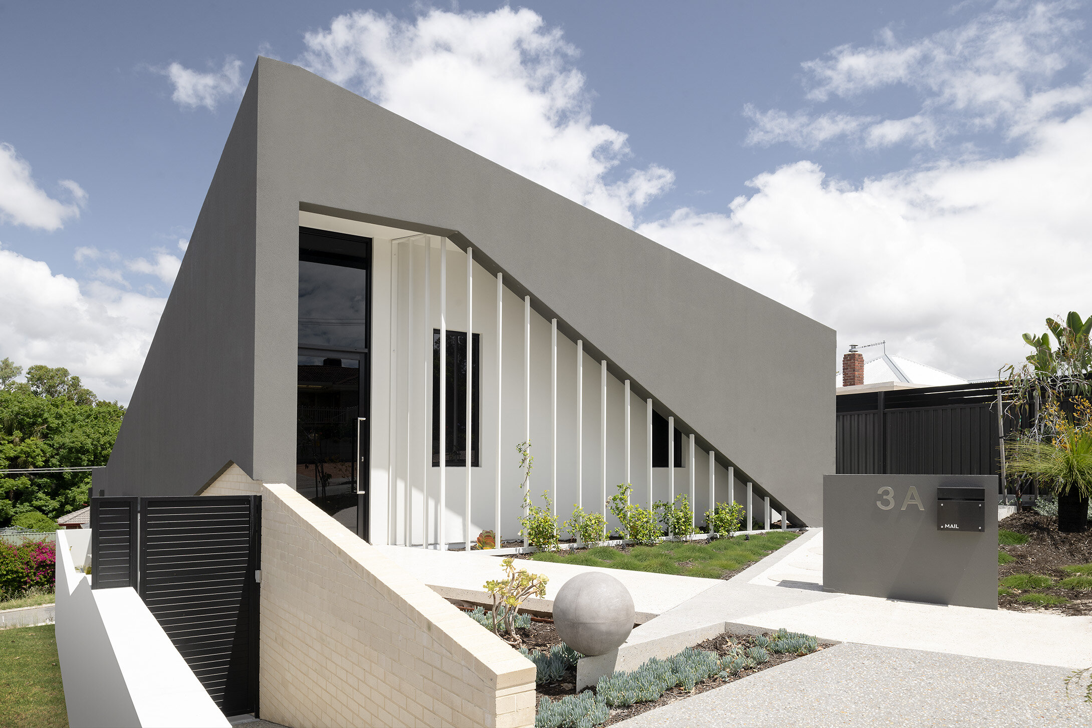
all images by d-max photography
GROUNDED HOUSE
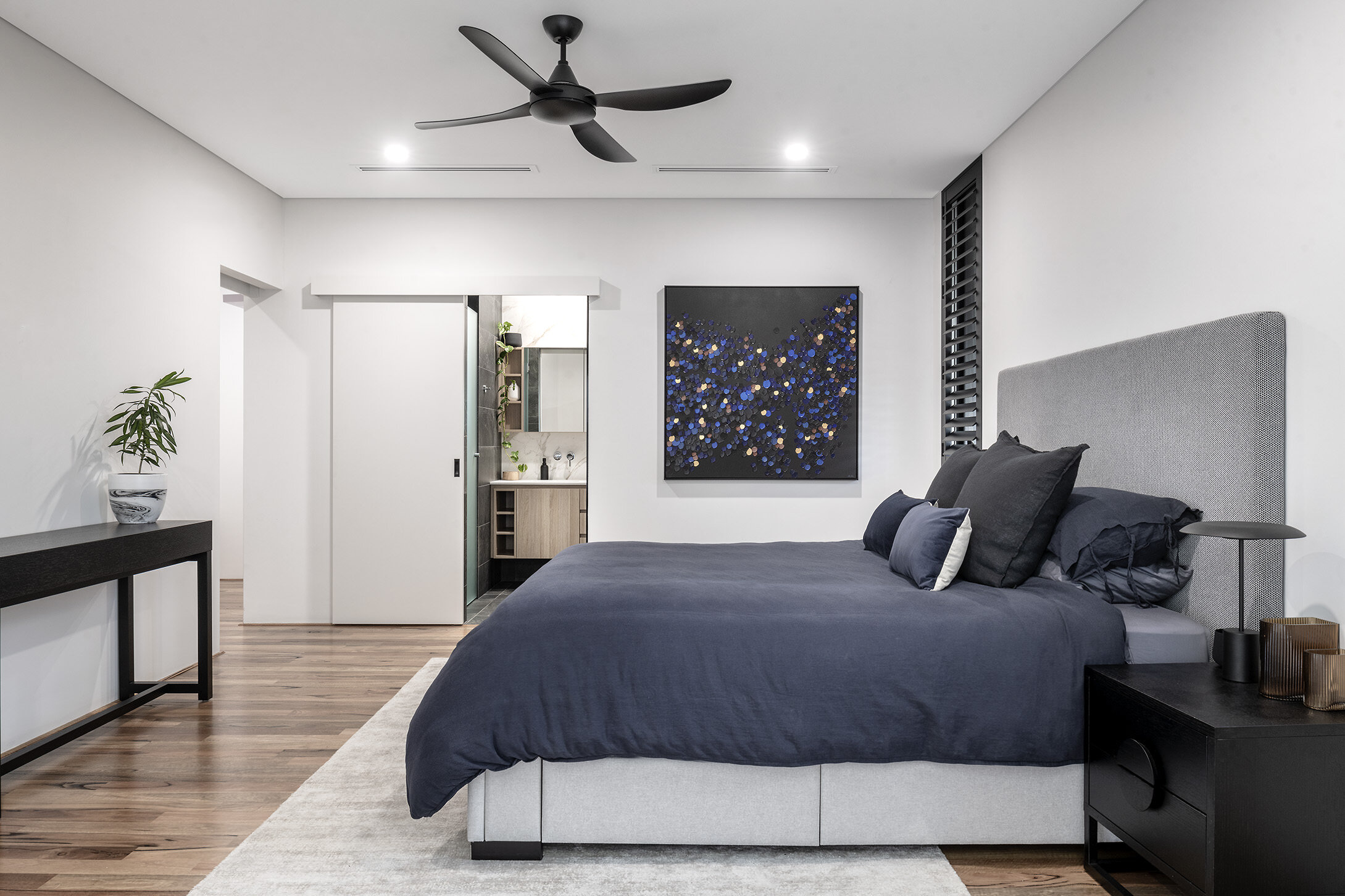
Looking back at the journey from when we were first approached to design this home, it is evident that the main issues or challenges became the inspirational triggers that sparked some of the beautifully created architectural spaces within this custom home.
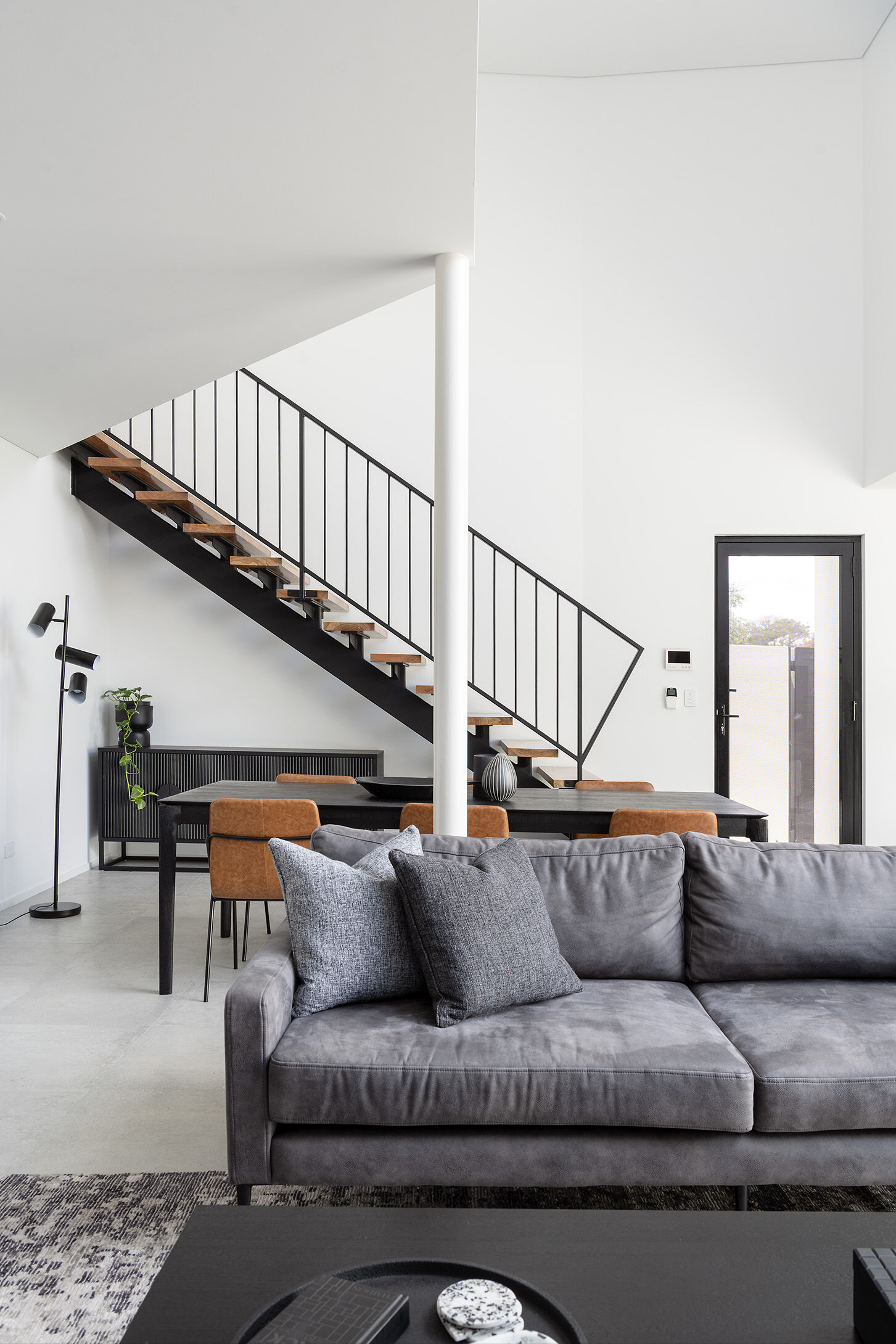
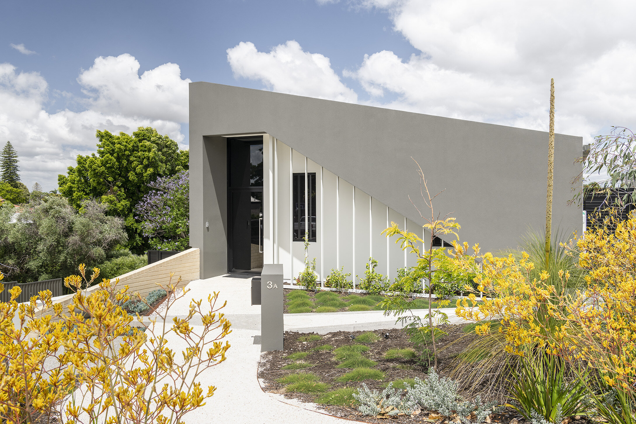
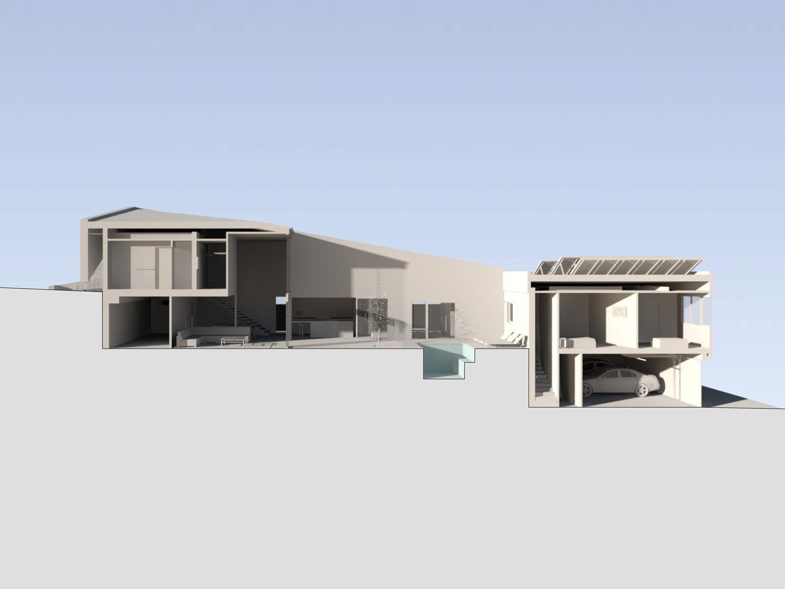
This home is split over three levels and has two street frontages consisting of a primary street for visitors and a secondary street where the undercroft garage is. All three levels of the home are wheelchair accessible despite the home not having a lift. This was just one of the many briefing requirements for this project.
During the space planning phase of the project, we explored several different scenarios before focusing on the idea of submerging parts of the home in response to the 7m undulation between the two street fronts. This allowed the main living spaces of the home to be situated within the middle level of the home, a common ground between the two streets. This idea of having submerged elements or ‘grounding’ the home, required guests entering the home from the primary street to transcend down before they encountered the main living areas of the home. This process of transcending either up or down, depending on which street you enter from, becomes the first point of evoking a sense of mystery and excitement as to what other surprises may follow.
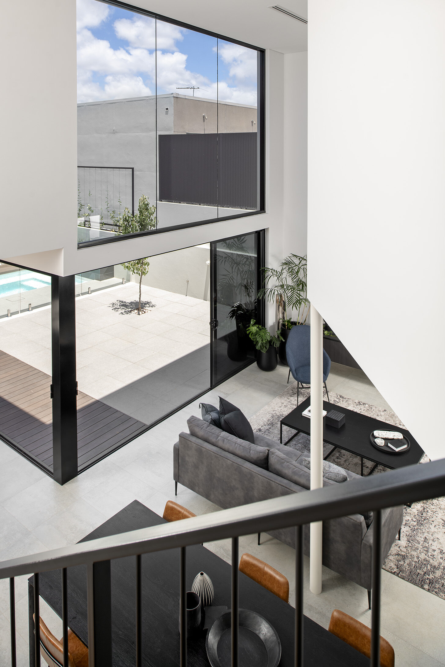
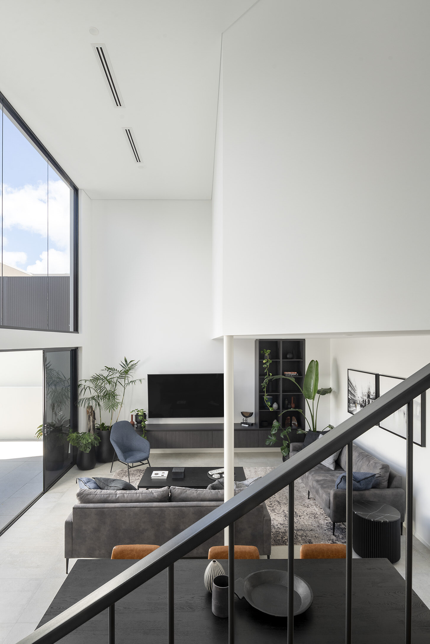
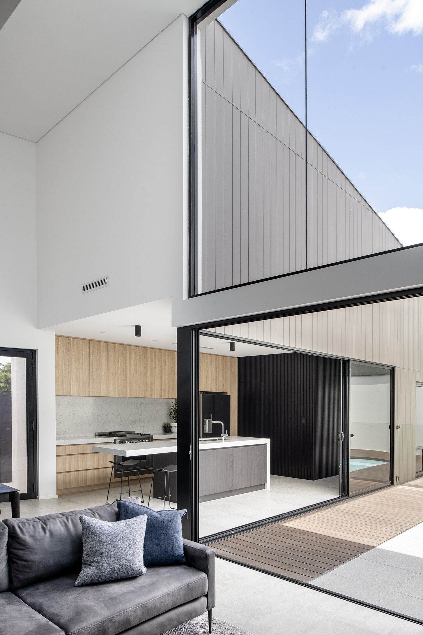
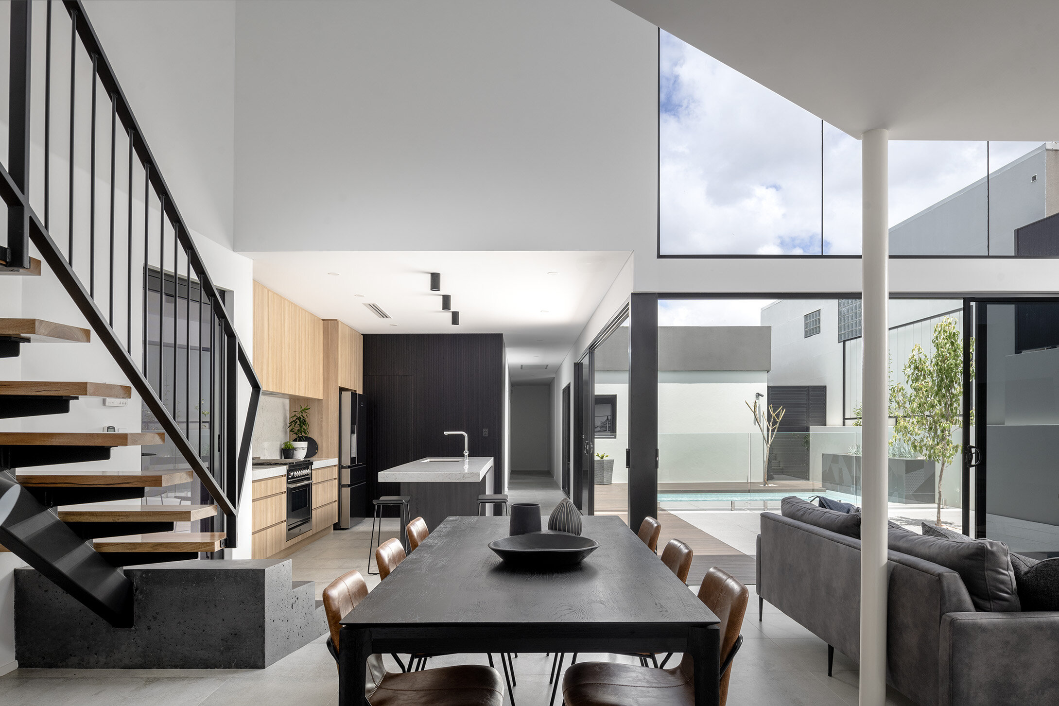
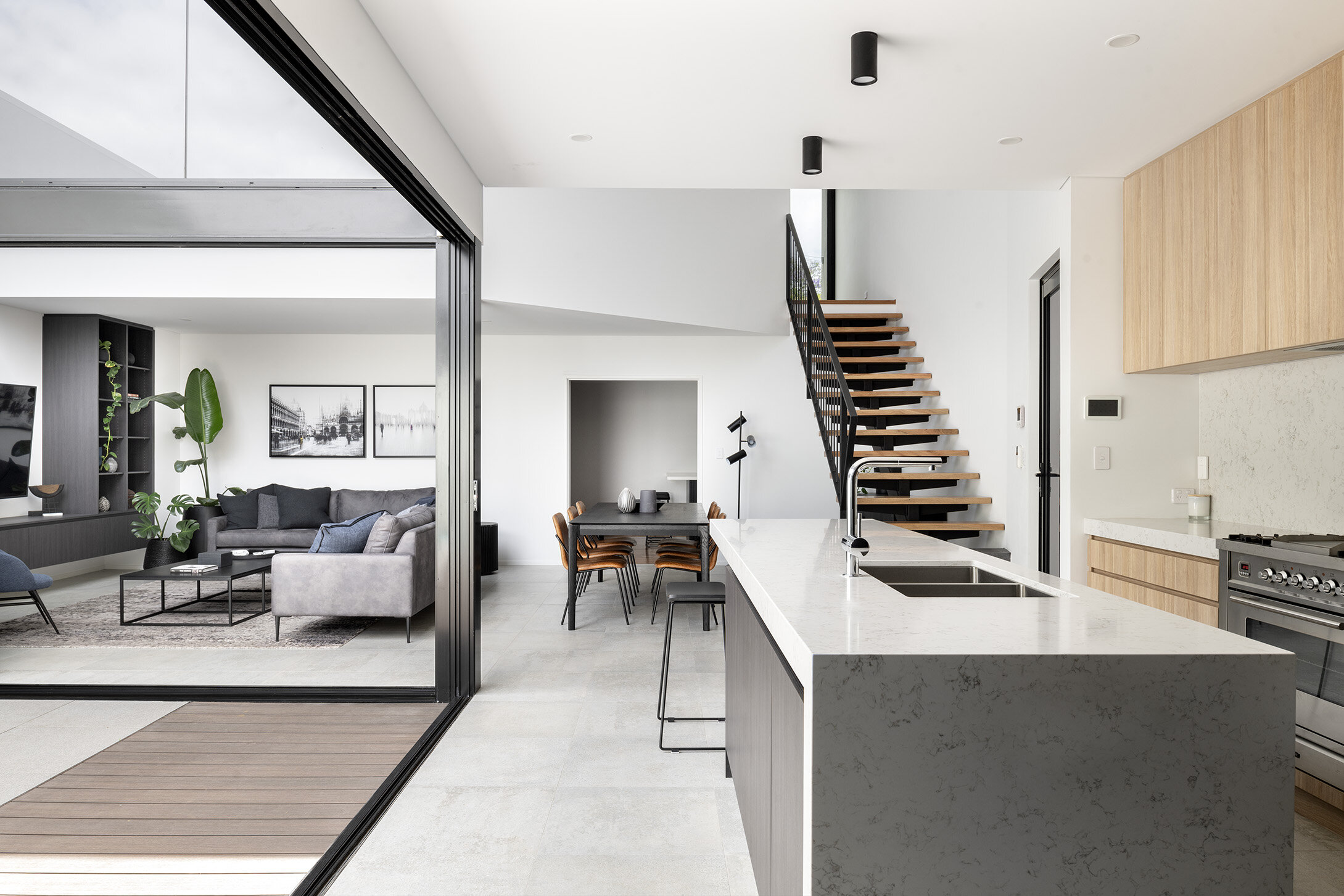
We were briefed to include lots of glazing, inclusive of a double volume space to the main living area and to ensure the home was focused around the ability to entertain family and friends. The clients wanted a strong connection between the indoor and outdoor entertaining spaces, but equally important was that the spaces felt secure and private.
Direct sunlight was forbidden from penetrating the main living spaces of the home as it was a “pet hate” of the client to have sun glare on the TV. This simple but unique briefing requirement prompted us to explore how the sun would move across the site at different times of the day and throughout the various seasons. The more we explored the sun and continued to address the clients’ briefing requirements, the more this notion of grounding the home enabled us to begin to connect the dots. The ability to showcase the 3-dimensional qualities of the home to the client and run solar studies allowed us to design the form of the home that would look striking whilst it functionally responded to either a solar shield to screen parts of the home from undesirable direct sunlight or to demonstrate how the design of the home was able to evoke the sensations of grandeur whilst offering privacy and protection.
The grounded nature of the home and the high walls enclosing the courtyard and pool area create a very exclusive, yet private feel with resort-like features. When inside the home and, in particular the courtyard, it is easy to forget you are in suburbia and not at some exotic villa in an overseas location.
This home really is “a wolf in sheep’s clothes” with so much disparity between what the house looks like from the street and what is the reality when you enter.
*Landscaping Design by Cultivart

